Yathzee
Yathzee / Dice with buddies - scopely 2021 - now
Introduction
In 2021, I joined Scopely to work on their evergreen games Yahtzee with Buddies and Dice with Buddies.
One of the most interesting challenges of this project was working with outdated elements, both in terms of the art and the codebase. While these limitations often required us to adapt our creative vision to fit the existing framework—even when the UX flow wasn’t ideal—it also pushed me to think outside the box and find innovative solutions. This balance between constraint and creativity made the project both demanding and rewarding. Since joining the team, I’ve worked on a variety of tasks, ranging from small updates to larger redesigns. Below is a selection of some of the work I’ve contributed to:
One of the most interesting challenges of this project was working with outdated elements, both in terms of the art and the codebase. While these limitations often required us to adapt our creative vision to fit the existing framework—even when the UX flow wasn’t ideal—it also pushed me to think outside the box and find innovative solutions. This balance between constraint and creativity made the project both demanding and rewarding. Since joining the team, I’ve worked on a variety of tasks, ranging from small updates to larger redesigns. Below is a selection of some of the work I’ve contributed to:
Details
TOOLS
Main tasks
Lucky Wheel Revamp
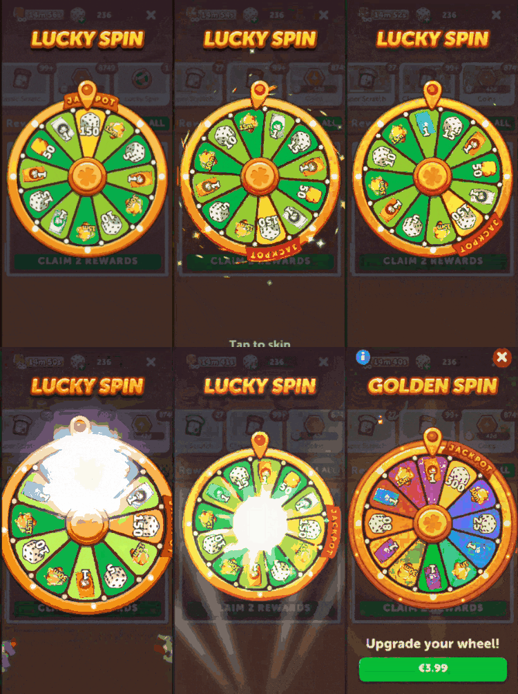
I worked on the revamp of the reward wheel feature, where players spin for prizes including high-value jackpots.
From ideation to implementation, I defined flows, prototyped animations, and built a theming system with varied colors, logos, and visual elements. The result was a bright, playful wheel that fit our casual style and boosted engagement.
From ideation to implementation, I defined flows, prototyped animations, and built a theming system with varied colors, logos, and visual elements. The result was a bright, playful wheel that fit our casual style and boosted engagement.

Regular Lucky Wheel

Premium Wheel

Animation
Wheel Icons relating to different game modes, giving you different prizes

Prize Calendar Revamp
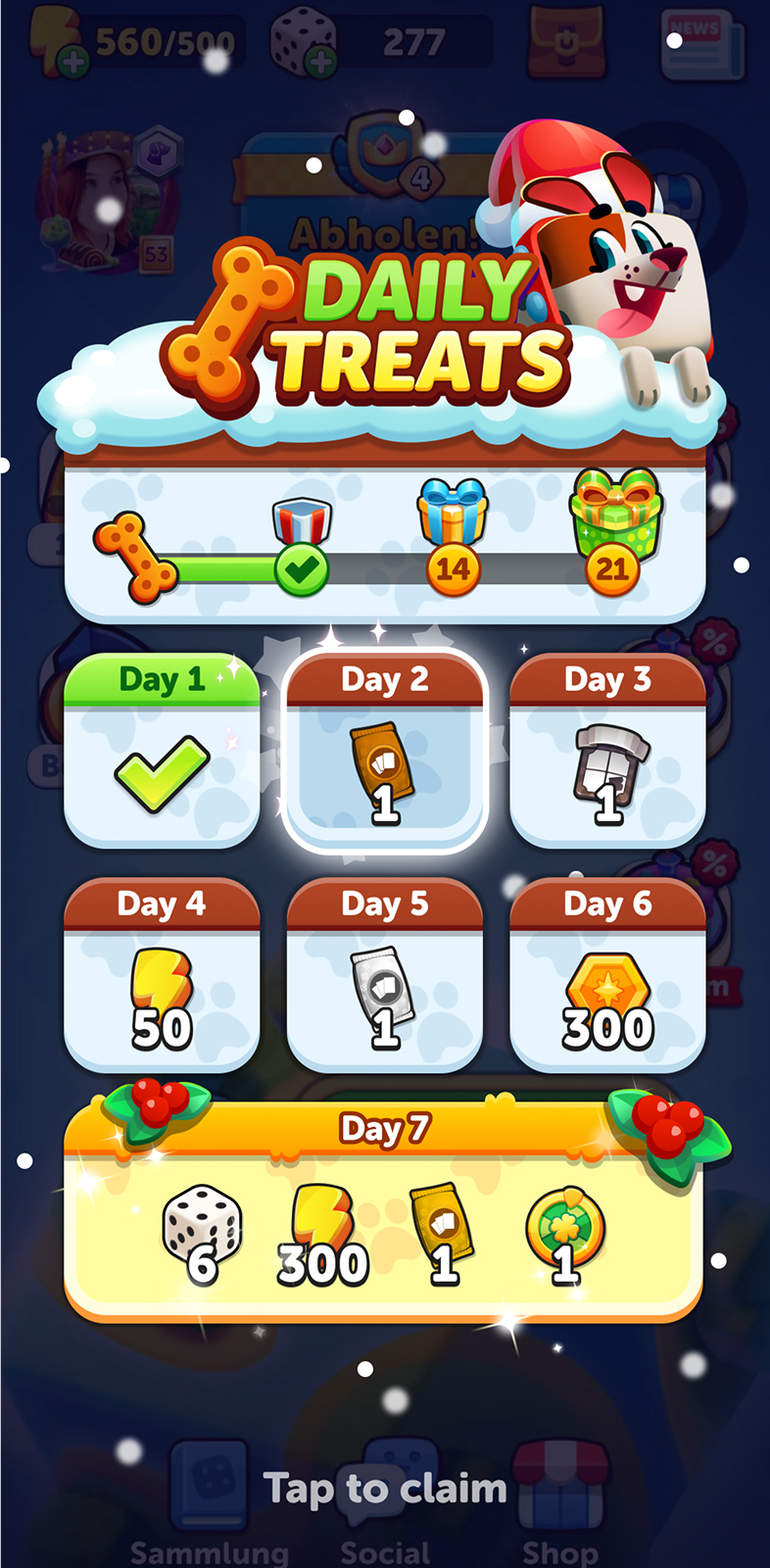
To improve retention, we revamped the daily prize calendar into a more appealing and rewarding experience. I worked on the visual direction, flow, and theming, ensuring usability while keeping it fresh with seasonal variations. The result was a dynamic calendar that encouraged daily return and matched our casual style.

Final Design

Start Popup

Animation

Home Lobby
The home lobby, our most-used screen, was redesigned to improve clarity and navigation. Early on, I helped define widget space and refine layout, later taking charge of the final widget and icon designs. The outcome was a cleaner, more engaging lobby that highlighted key features while reinforcing the game’s personality.

Final Design

Design Evolution

I created a new widget style focused on clarity and usability, ensuring clear distinctions between types. I also produced detailed guidelines so the team could maintain consistency while allowing flexibility for future updates.


I designed a set of simplified navigation icons to keep screens clean and focused. They were intuitive, unobtrusive, and fit seamlessly into the overall style, ensuring smooth, effortless navigation for players.

Event: Cat & the Beanstalk
In this event, players earned tokens to grow a magical beanstalk toward a castle in the sky, unlocking rewards along the way. I worked from concept to implementation, shaping the theme, delivering final assets, and ensuring seamless Unity integration true to the original mockups.

Final Design

Theming

Prototype

Event: Tropical Race
The Tropical Race event had players compete to reach the finish line by winning matches faster than opponents. I handled the feature end to end, defining the theme, designing UI, creating custom icons, and polishing the experience to feel smooth, exciting, and on-brand.

Final Design

Start Popup

Event Popup - combing the Tropical Race event with Lucky Wheels as rewards.

Iconography
For the Family Feast mode, I helped shape the new dish icons, working with the art team to create a playful, consistent style that matched the fun, casual spirit of the game.


For Tournaments, I designed league icons that felt distinct yet showed clear progression. This allowed players to easily track success while reinforcing the competitive tone.
Extending the league iconography, I designed progression-based chests used across modes. This created a cohesive visual language that tied features together and gave the game a polished, unified feel.


.png)